I’ve been a big Resident Evil fan since Resident Evil 2 came out in 1998. I never had the original release of RE1; I only managed to snag the Greatest Hits version of Resident Evil: Director’s Cut, so even though the dude on the front always looked a bit weird to me, I never realized just how strange the original Resident Evil cover art is.
I recently snagged a pristine copy of the original long box Resident Evil and took my first real long look at what’s happening on the cover. Most cover art in the Resident Evil series makes sense. You got a zombie an eyeball, or maybe a shot of the characters. Sometimes it’s a combination of the three. For the most part, though, it’s standard fare.
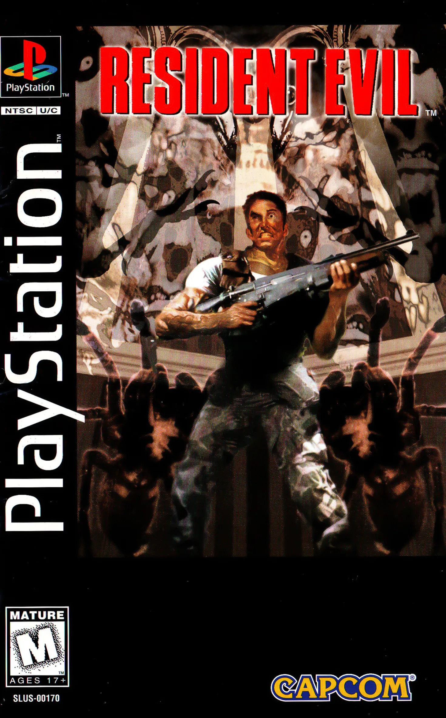
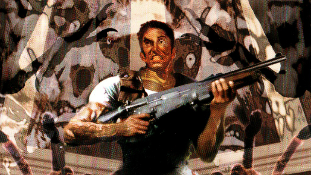
The original Resident Evil cover, on the other hand, is nuts. A lot is going on there that makes no sense. First, you got a dude. This dude isn’t Chris by the way. You might have thought, like I did, that it was just a real-life model playing a terrible Chris Redfield. It’s not. It’s Richard Aiken. You probably remember him as the dude who gets eaten by a big damn snake (or a big damn shark alternatively). He’s the S.T.A.R.S. Bravo Team communications expert and gets a more prominent role in the Resident Evil remake and is even in Resident Evil 0 for a second or two, but in the original game, he’s pretty much just sitting around waiting to die.
So, Richard is on the cover, and he’s holding some ungodly abomination of a gun. This thing is like the rear of an M16/M4-type rifle, and then maybe a stretched out AK-type receiver in the middle and then straight into a shotgun for the barrel. You can even see where the gun kind of awkwardly blends into the wood furniture of the shotgun pump.
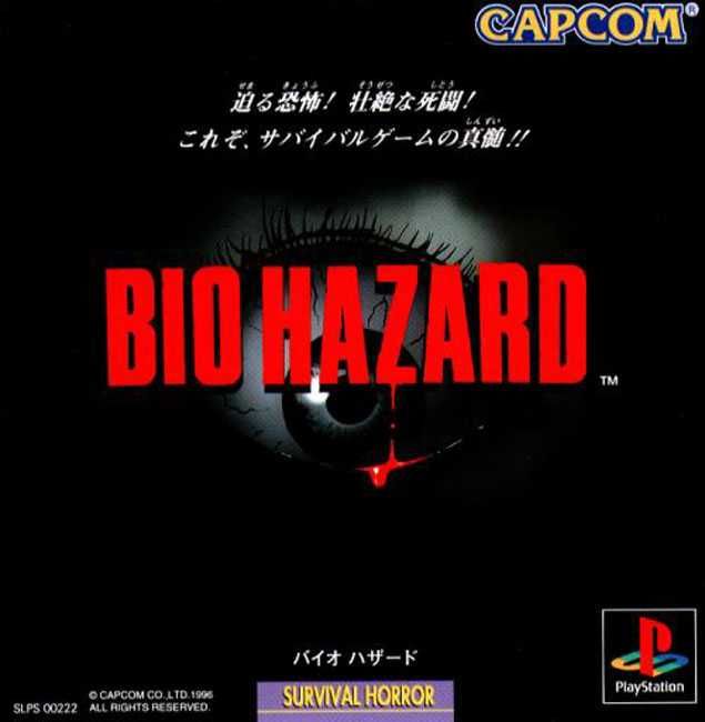
Ole Richard looks pretty flushed (or splotchy), and it’s with good reason. Weird symmetrical spiders are by his legs, and it looks like about six zombie faces are being projected on to him by some unknown source. In contrast to the Japanese version of the cover, which is just an eyeball, it’s a veritable circus here.
So, what’s the story behind the cover? It was the 1990s, so it’s not a massive surprise that the graphic design of the Resident Evil box art is over-the-top. However, this is even a little weird for 1996. There are a few stories I’ve seen concerning the RE1 box. One is that Capcom just lifted the art off a cover a Marvel promo comic (which starred Richard Aiken) for the game. This doesn’t really make any sense since the comic came out a month after the game did in North America, but who knows.
One explanation for the cover art’s unique style is that Bill Sienkiewicz did it. Sienkiewicz has done a ton of covers and artwork for comics and graphic novels, and when you look at the Resident Evil box art from that perspective it makes a lot of sense since symmetry, and exaggerated facial expressions are hallmarks of comic cover.
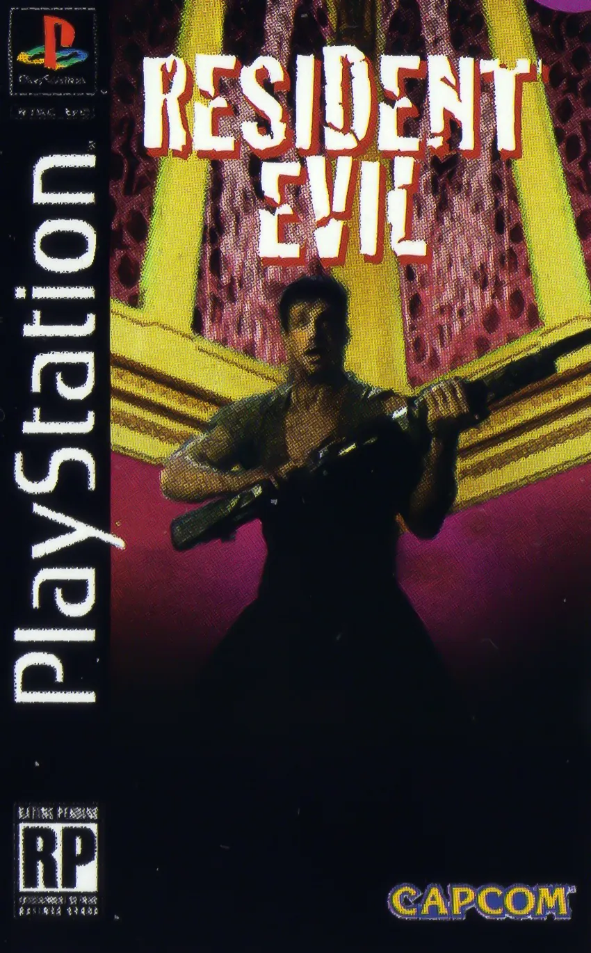
There’s an image that has made its rounds for about a decade or, so that is supposedly the pre-release cover for Resident Evil, which features Chris Redfield. I think I remember seeing it in an old gaming magazine around that time, but I couldn’t verify the prominence of it. It’s entirely possible this was the initial art and when Capcom saw Sienkiewicz’s cover for the one-shot Marvel comic it was decided to use that instead. Alternatively, this could have been an early or alternate draft from Sienkiewicz, which I’d buy since the background and pose from the character is very similar to the final.
In any case, the box art of the original Resident Evil is one that sticks in my head. I like the Japanese eyeball cover, but it just doesn’t have the character that the US/Europe version has. It fits the game perfectly. It was an experimental title that broke the mold in many ways, and almost single-handedly brought the survival horror genre to the mainstream. It’s appropriate then that the cover art would stand out amongst its contemporaries. It’s weird, but it’s not bad, and there’s much depth there behind the 1990s cheese.